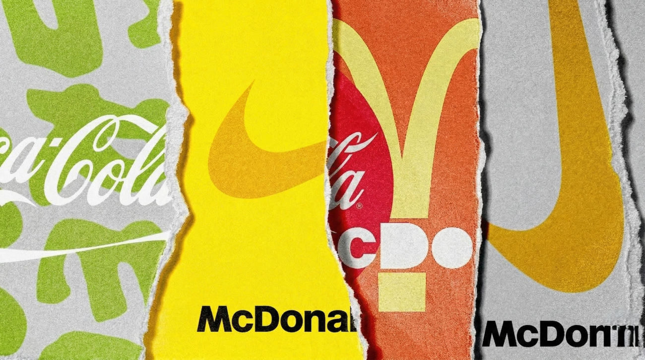
The major brands now choose to create their logos with playful and retro style elements because their existing logo designs match the modern trend of minimalist design. The “de-branding” movement establishes a new aesthetic standard which uses bold colors and thick shapes to create a design style that resembles 1990s toy products. To create emotional connections with customers, brands use childhood design elements which make their products appear less like serious businesses.
The “Anti-Minimalist” Rebound
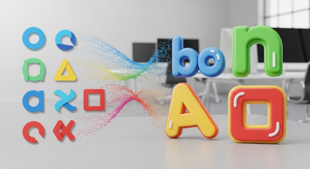
For years, every brand from Google to Pringles simplified their logos into flat, boring shapes. The internet has made our designs too similar, so brands now add design elements through thick outlines which create a physical experience instead of a digital one.
Nostalgia as a Safety Blanket
Millennial and Gen Z shoppers feel secure and happy when they see products which use 90s toy designs. Companies create products which make customers feel comfortable through their use of bright “Lego-like” palettes and rounded corner designs.
The Burger King Transformation
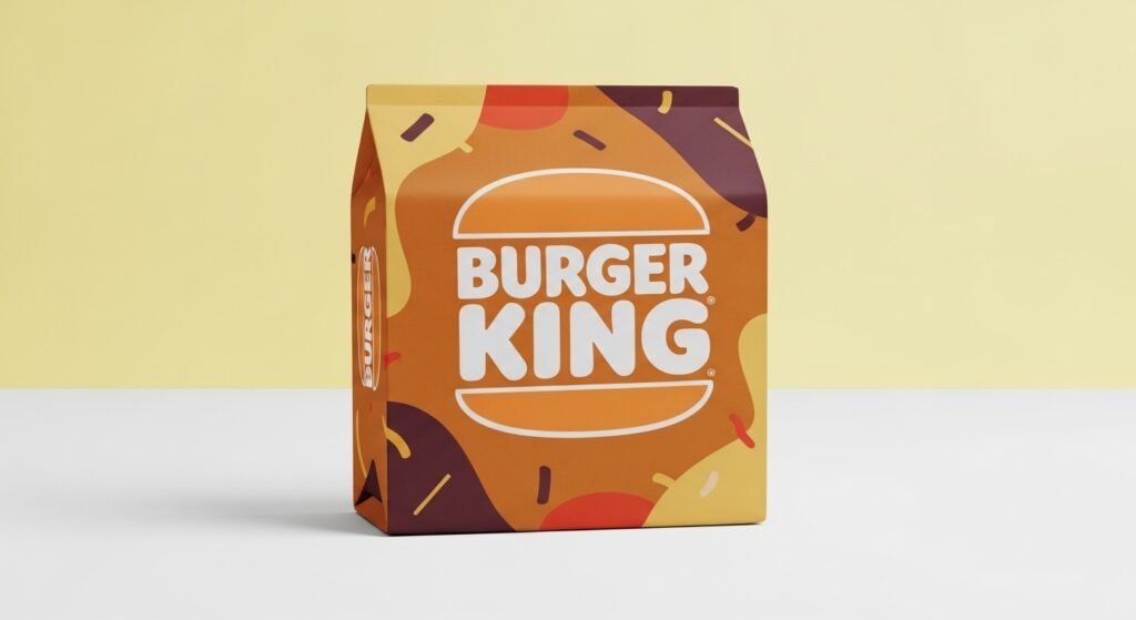
Burger King’s 2021 rebrand established the new standard which all brands would follow. The company replaced its shiny metallic “blue swoosh” design with a soft chunky font which used warm colors to create a look that matched their 1990s packaging style, which made customers consider the food to be more “real” and less processed.
Brat-Summer and Neon Colors
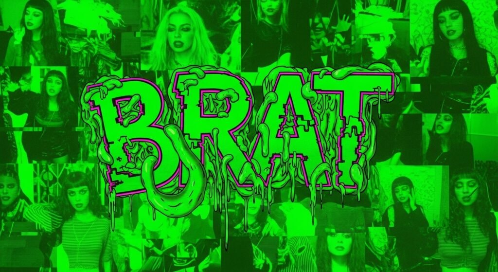
The viral success of “Brat” by Charli XCX proved that “ugly-cute” and bold, toy-like neon greens are in. Brands are adopting these “low-fidelity” colors to look more authentic and less like they were designed by a corporate committee.
Tactile “Squishy” Graphics
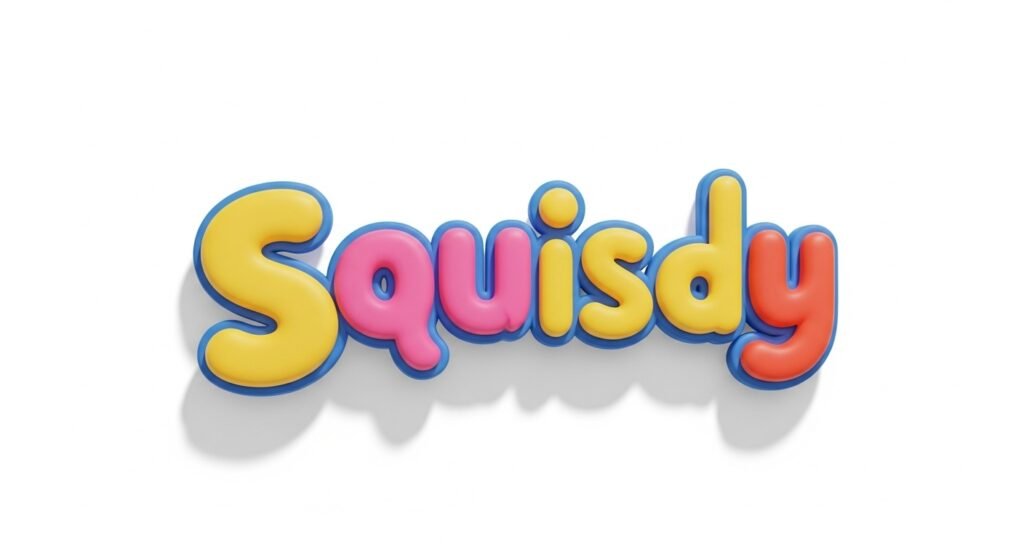
New 3D design tools allow brands to create graphics that look like they are made of rubber or plastic and the “squishy” texture creates a friendly and touchable brand experience similar to the tactile experience of a Fisher-Price toy.
The Decline of “Premium” Sans-Serif
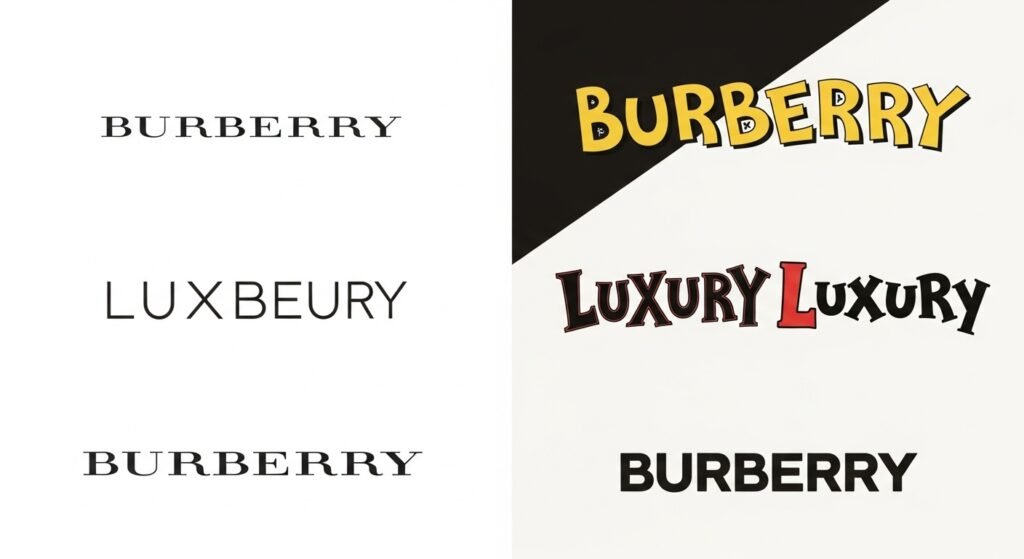
The “blanding” era—where every luxury brand used the same thin, black font—is dying. Burberry has returned to design styles which show their identity through unique and distinctive design patterns.
Physical Merchandise Potential

Toy-shaped logos make it easy to create physical products from their design. The current design process involves “merch” because brands develop characters and symbols which can be made into plushies and keychains and plastic collectibles.
Humanizing the Algorithm
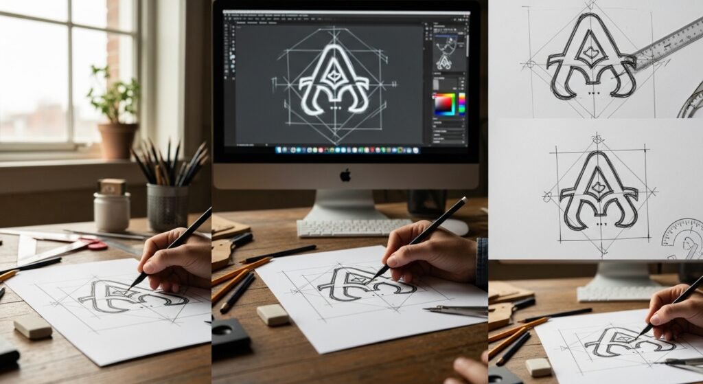
People want “human” flaws to exist in AI because its presence has increased. Chunky hand-drawn-style logos create a personal touch which helps brands escape the “soul-less” perception that comes with advanced automated systems.
The “Kidult” Economy
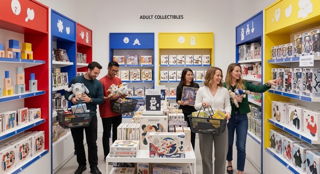
Adults are spending more on toys than ever before and brands use “de-branding” to create a toy appearance because their target audience of adult customers with spare money already shows positive response to “toy-etic” design elements and bold primary color schemes.
Pepsi’s Bold New “Pop”
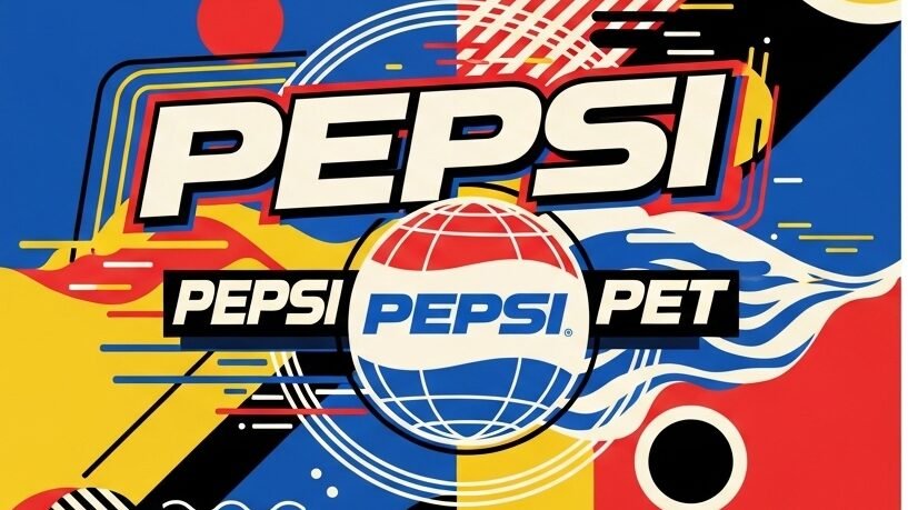
The new Pepsi logo embodies the energy of 90s toy design. The package uses a heavy bold typeface with bright saturated colors to create visual impact, which changes from a “slim and healthy” appearance to a classic soda style.
